If PageSpeed Insights, Lighthouse, or Search Console makes you feel like you need a translator, you’re not alone. A Core Web Vitals report can look packed with warnings, charts, and labels that seem more technical than useful.
The good news is that the core idea is simple. Google is checking three basic parts of page experience: how fast the page looks ready, how quickly it reacts, and how steady it stays while loading. Once those ideas click, the report gets much easier to read.
Key Takeaways
- Core Web Vitals check three key user experience parts: LCP (how fast the main content loads), INP (how quickly the page reacts to clicks), and CLS (whether the layout stays stable), with good ranges under 2.5s, 200ms, and 0.1.
- Always start with field data from real users (CrUX report) as it shows actual visitor experiences; use lab data only for troubleshooting causes.
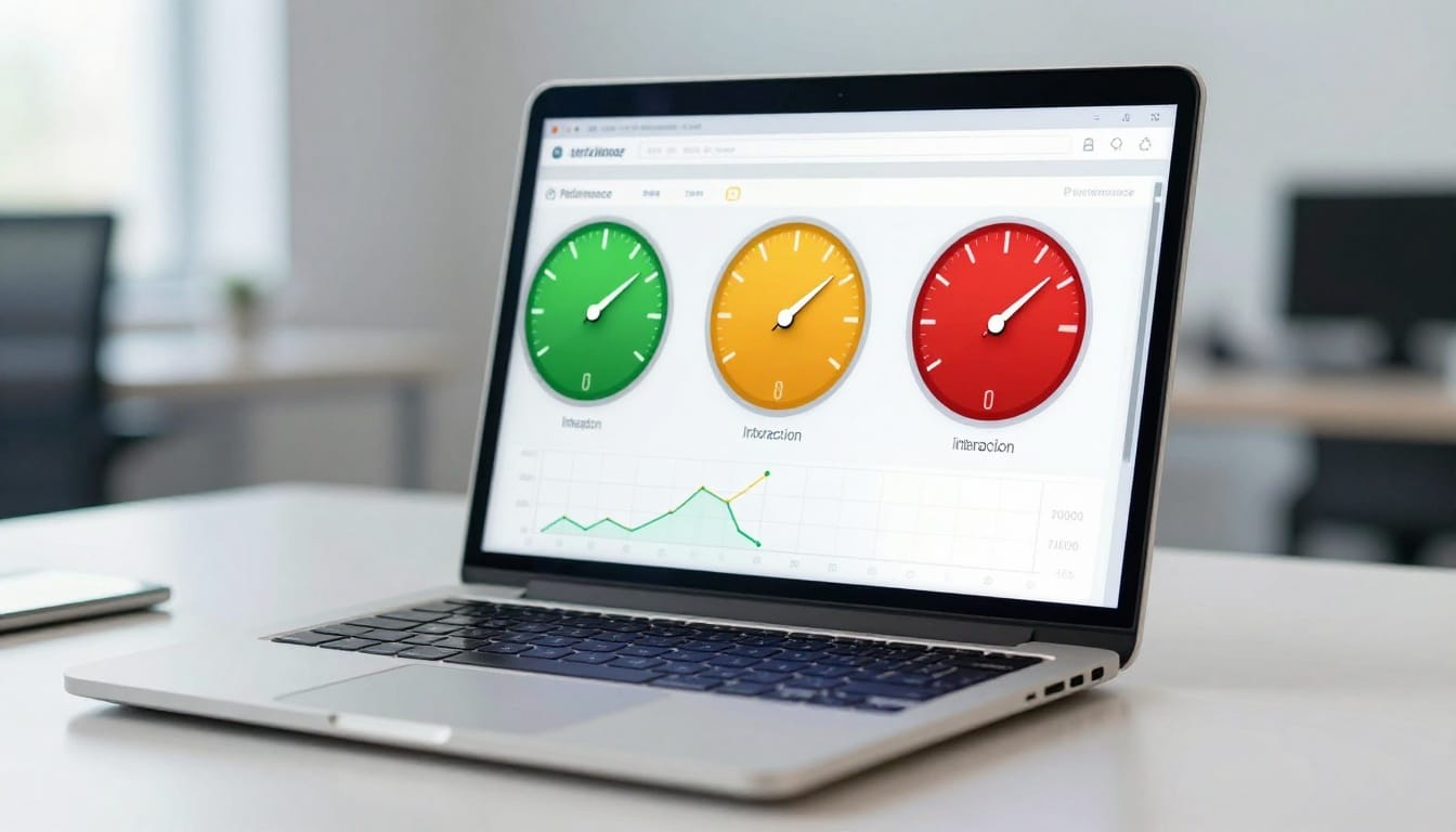
- Read reports by focusing first on colors (green good, orange needs work, red poor), the failing metric, and related opportunities—ignore everything else until then.
- Fix issues one at a time starting with high-traffic pages: compress images for LCP, trim JavaScript for INP, set image dimensions for CLS, then recheck reports.
- The 75th percentile score reflects slower real-world visits, so even if your page works fine on fast devices, it may still need tweaks for broader users.
Start here: what Core Web Vitals are and why they matter
Core Web Vitals are Google’s main Page Experience checks. They focus on the user experience people feel when they open and use your page, not only what a machine sees in a test.
That matters because slow, jumpy, or laggy pages lose trust fast. A visitor may not know what LCP or INP means, but they do know when a hero image takes forever to show up, or a button feels stuck. If that happens on a landing page, sales page, or lead form, conversions can slip.
As of April 2026, the targets are still the same. A page needs all three metrics in the good range to fully pass.
Here are the ranges in plain English:
| Metric | Good | Need improvement | Poor status |
|---|---|---|---|
| LCP | Under 2.5s | 2.5s to 4.0s | Over 4.0s |
| INP | Under 200ms | 200ms to 500ms | Over 500ms |
| CLS | Under 0.1 | 0.1 to 0.25 | Over 0.25 |
Green means good. Orange means Need improvement, where people are probably feeling some friction. Red means Poor status, where enough visitors are having a bad experience that the issue deserves attention.
The three things Google is checking on your page
LCP stands for Largest Contentful Paint. In plain English, it measures how long the biggest thing people see takes to appear, often a hero image, a large banner, or a main heading block.
INP stands for Interaction to Next Paint. It measures how fast the page reacts after someone clicks, taps, or presses a key. Think of a laggy menu or a slow Add to Cart button.
CLS stands for Cumulative Layout Shift. It measures whether things move around while the page loads. For example, text might shift down when an ad or image appears late.
What the green, orange, and red labels actually mean
The color labels aren’t meant to scare you. They’re quick signals.
Green means most visitors are getting a solid experience. Orange means the page still works, but enough people may feel a delay or annoyance. Red means a meaningful share of visitors are having a poor visit.
Google also uses something called the 75th percentile. That sounds technical, but the idea is simple. The 75th percentile is how Google buckets real-world visitors, so the score reflects how the slower end of real visits performs, not only the best-case visit on a fast laptop. Google’s Core Web Vitals report help page shows how those real-user groups are judged in Search Console.
Read the color and the failing metric first. You do not need to decode every warning on the page in one pass.
How to read a Core Web Vitals tester report without feeling buried
When you open a report, resist the urge to read every line from top to bottom. That usually creates more confusion than clarity. Start with the score status, then the metric, then the likely cause.
First, look for field data. Field data, derived from the CrUX report (also known as the Chrome User Experience Report), means real world usage data from real visitors, usually collected over the last 28 days. This matters most because it reflects what people actually experienced on real phones, real networks, and real browsers.
Next, compare it with lab data. Lab data is a controlled test run in a set environment. It’s useful for troubleshooting, but it’s still a snapshot. A lab test can look fine while field data looks poor, because real users may have older devices or weak mobile connections. If you want a second plain-English walkthrough, this guide on how to read a PageSpeed Insights report can help.
Check field data first, then use lab data to spot likely causes
If field data says LCP is poor, treat that as the real problem even if the lab run looks decent. In other words, your page may work well in the test but not for enough real visitors.
Meanwhile, if lab data is poor and field data is missing, you still have a clue, but not a final answer. That’s common on newer pages or low-traffic pages. In that case, use lab results as hints and watch the page over time.
What opportunities, diagnostics, and real-user data sections mean
Reports often use labels that sound heavier than they are.
Opportunities are likely improvement ideas. These are often the most useful part for non-developers because they point to likely wins.
Diagnostics are supporting clues. They tell you what may be slowing the page or causing unstable behavior, but they aren’t always the main issue.
Real-user data means actual visit data, often in Search Console or PageSpeed Insights. When reviewing a Search Console property, you might see issues grouped by a URL group rather than individual pages. The Core Web Vitals tool documentation also explains this split between field data and lab data in simple terms.
Don’t try to fix every warning in diagnostics. Tie each note back to the main failing metric first.
How to make sense of LCP, the loading speed number
Largest Contentful Paint (LCP) is the loading number most people understand fastest because it matches a basic feeling about loading performance: “When did the page look ready?” It measures when the biggest visible thing near the top of the page appears, specifically the time until the rendering largest content element.
Good is under 2.5 seconds. Needs improvement is 2.5 to 4.0 seconds. Poor is over 4.0 seconds.

### What LCP is measuring and what the report wording usually points to
In many reports, the Largest Contentful Paint element is a large image, banner, or heading block above the fold, meaning visible without scrolling. If that element appears late, the page feels slow even if smaller pieces are loaded earlier.
Some report wording sounds technical, but it often has a simple meaning. Render-blocking resources mean files are getting in the way before the main content can show, which can delay First Contentful Paint. Server response time, tied to Time to First Byte, means the hosting takes too long to start sending the page. Large network payload usually means big files, often images or scripts, are slowing down delivery.
Common reasons LCP scores are bad, and what you may be able to fix yourself
A common example is a homepage hero image that’s huge, set as a slider, and loaded before anything useful appears. The visitor sees a blank or half-built page for too long.
You can often fix part of this yourself. Compress oversized images, replace sliders with one static image, and remove heavy above-the-fold elements that don’t help the visitor. If you need more practical ideas, Seoperform’s guide on fixing slow landing pages covers owner-friendly speed wins.
Some LCP problems need a developer. Slow servers, code changes, and how the site loads CSS or JavaScript often fall into that bucket.
How to understand INP, the responsiveness score
INP, or “Interaction to Next Paint,” measures how fast the page reacts after a person interacts with it. This field metric has replaced the older “First Input Delay.” Good is under 200 milliseconds. Needs improvement is 200 to 500 milliseconds. Poor is over 500 milliseconds.
This metric matters because a page can look loaded and still feel slow, affecting overall page performance. That’s the frustrating part. The visitor sees the page, clicks something, and nothing seems to happen right away.

### What INP looks like in real life when a page feels slow to react
Picture someone tapping Add to Cart, opening a mobile menu, using a filter, or submitting a form. If the button looks pressed but the page takes a beat to react, that’s the kind of delay INP is measuring.
Reports may mention long tasks or main thread work, along with related lab metrics like Total Blocking Time. In plain English, the browser is too busy doing other jobs to respond quickly. That busy work often comes from scripts, pop-ups, animations, or third-party tools all firing at once.
How to read INP warnings and know when the problem is probably JavaScript
If your Core Web Vitals tester report keeps pointing to script execution, unused JavaScript, or third-party code, there’s a good chance JavaScript is behind the lag.
Site owners can often help by trimming plugins, chat widgets, pop-ups, tracking tools, and apps that aren’t pulling their weight. Developers may need to split up large scripts or delay non-essential work. If you want more context on Search Console patterns, this updated guide to Core Web Vitals in Google Search Console shows how issue groups tend to appear there.
How to read CLS, the score for page jumping and shifting
CLS, or Cumulative Layout Shift, measures visual stability. Good is under 0.1. Needs improvement is 0.1 to 0.25. Poor is over 0.25.
Unlike LCP, CLS isn’t about speed alone. It’s about whether the layout stays put while the page builds.

### What counts as a layout shift, and why small jumps can feel so annoying
A layout shift happens when content moves after the reader has already started looking or interacting. For example, you’re about to tap a button, then a banner loads above it and causes an unexpected layout shift that pushes everything down. Now you click the wrong thing.
Small jumps feel worse than they sound because they interrupt the person’s action. Common causes include images without fixed dimensions, ads that load late, banners inserted above content, and web fonts that change text size after the page starts rendering.
How to read CLS clues in a report and decide what to fix first
Report clues for CLS often point to missing image sizes, unstable ad slots, or dynamic content added above existing content. Start with the most visible shift near the top of the page, especially around buttons, forms, and calls to action.
In many CMS platforms, you can fix some CLS issues yourself by setting image dimensions, avoiding surprise banners, or placing promo bars in consistent spots. Template changes and ad slot setup often need a developer, because those shifts may come from the theme or page structure.
A simple checklist for reviewing any report from top to bottom
When you open any Core Web Vitals tester, use the same calm order every time:
- Check whether field data exists.
- Note which metric fails first: LCP, INP, or CLS.
- Check results for both mobile and desktop to see whether the problem is worse there.
- Read the related opportunities and diagnostics for that one metric.
- Look for patterns across similar page templates.
- Pick one fix at a time, starting with pages that drive traffic or leads.
- After implementing changes, return to your Core Web Vitals report to validate fixes.

That last step matters most. If you chase every warning, you’ll waste time. If one metric is clearly failing, focus there first. If the same issue shows up across many landing pages, it may be worth reviewing broader technical fixes for fast landing pages instead of treating each page as a separate mystery.
A Core Web Vitals report works best when you treat it as a map for improving overall user experience, not a technical scorecard. LCP tells you when the main content shows up, INP tells you how fast the page reacts, and CLS tells you whether the layout stays still.
That means you don’t need to fix everything at once. You only need to understand what the failing metric is saying, then take the next smart step.
Frequently Asked Questions
What are the good thresholds for Core Web Vitals metrics?
Good scores are LCP under 2.5 seconds, INP under 200 milliseconds, and CLS under 0.1. Pages need all three in the good range to pass fully. Orange means some friction for users, while red signals a poor experience for many visitors.
What’s the difference between field data and lab data in reports?
Field data comes from real users over the last 28 days via the CrUX report, showing actual experiences on various devices and networks—prioritize this. Lab data is a controlled test snapshot, great for spotting causes but not the full picture. If field data is poor but lab is good, real visitors face issues like slow connections.
How should I approach reading a Core Web Vitals report?
Start with the overall status color, failing metric, and field data. Then check opportunities and diagnostics tied to that metric only. Use the checklist: check mobile/desktop, patterns across pages, fix one thing, and validate changes.
Can I fix Core Web Vitals issues without a developer?
Yes, often: compress hero images and remove heavy sliders for LCP, trim plugins and widgets for INP, set fixed image sizes and avoid surprise banners for CLS. Developer help is needed for server speed, code optimizations, or theme changes. Focus on above-the-fold elements and high-traffic pages first.
Why use the 75th percentile in Core Web Vitals scores?
It measures how the slower 25% of real visits perform, reflecting broad user experiences beyond best-case tests. This ensures scores account for typical phones, networks, and browsers. Google groups real-user data this way in Search Console for accurate page experience signals.