
Core Web Vitals Tester Report, in Plain English
A page owner opens a performance report and sees green, yellow, and red. The colors are clear, but the next move often isn’t. A Core Web Vitals tester report can feel like a dashboard full of warnings when you only need to know what is slowing visitors down.
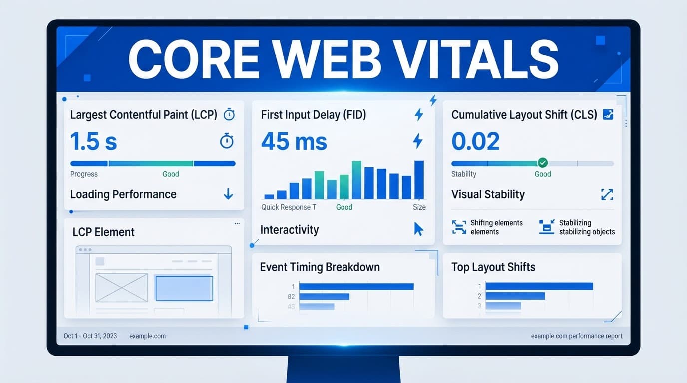
Core Web Vitals measure the real user experience, not whether a page earns a perfect technical score. Read the three main performance metrics first, then use the report details to find the cause.
Key Takeaways
- LCP measures when the main visible content appears.
- INP measures how promptly the page reacts after a visitor interacts.
- CLS measures whether the layout shifts while the page loads.
- A passing Core Web Vitals result usually requires all three metrics to meet Google’s targets at the 75th percentile.
- Start with failed field data on important page templates, then use lab tests to diagnose the cause.
What a Core Web Vitals Tester Report Is Telling You
A tester report combines performance metrics with clues about delays and layout movement. Its lab data shows how a page behaves under controlled conditions. Google’s Core Web Vitals documentation defines the three signals as loading performance, responsiveness, and visual stability.
A single-page lab data result is a close-up photo. Google Search Console provides a broader view by grouping URLs with similar issues across a site. Comparing lab data with data from those groups can reveal whether an issue affects a single page or an entire template. Google Search Console also relies on field data from real visitors.
A page generally passes when all three Core Web Vitals meet the “good” threshold at the 75th percentile. Lab data can help explain why a result misses that threshold. The overall performance score is useful, but it isn’t the same test.
| Metric | What visitors feel | Good | Needs improvement | Poor |
|---|---|---|---|---|
| LCP | Main content appears | 2.5 seconds or less | Over 2.5 to 4 seconds | Over 4 seconds |
| INP | Page reacts after an action | 200 ms or less | Over 200 to 500 ms | Over 500 ms |
| CLS | Content stays in place | 0.1 or less | Over 0.1 to 0.25 | Over 0.25 |
The colors matter less than the metric behind them. A green score cannot cancel out a red interaction delay.
LCP shows how quickly the main content appears
Largest Contentful Paint, or LCP, tracks when the largest meaningful item in the first view appears. It may be a hero image, a product photo, a large headline, or the main content block.
An LCP at 2.5 seconds or faster is good. Between 2.5 and 4 seconds needs work. Anything over 4 seconds leaves visitors staring at an unfinished page.
Lab data can help identify whether the delay comes from the server, the asset, or browser processing. Slow servers, oversized images, render-blocking CSS or JavaScript, and weak caching often push LCP upward. Use lab data to identify the element named in the report.
Time to First Byte can reveal slow server response time, but it is a diagnostic, not a Core Web Vitals metric. When lab data shows a delayed element, check its file size and the resources the browser processes first.
INP shows how fast the page responds to people
Interaction to Next Paint, or INP, measures the wait between an action and the page showing a visible response. A visitor taps a menu, adds an item to a cart, or opens an accordion. Lab data can help reproduce whether the page reacts promptly.
Google rates 200 milliseconds or less as good. Results from 200 to 500 milliseconds need improvement, while anything above 500 milliseconds is poor. INP replaced First Input Delay as a Core Web Vitals metric because it captures responsiveness across a visit rather than only the first interaction.
JavaScript-heavy pages often struggle here. Long tasks can lock the browser’s main thread, while third-party chat tools, tag managers, ads, and trackers add more work at the worst moment. Compare lab data across runs to find scripts that consistently delay interaction.
CLS reveals whether the layout jumps around
Cumulative Layout Shift, or CLS, measures unexpected movement on the page. A button shifts just as someone taps it. An image loads late and pushes a paragraph downward. A banner appears above a form and moves the submit button. Controlled lab data can make these shifts easier to spot.
A CLS score of 0.1 or below is good. Scores above 0.1 through 0.25 need improvement. Anything above 0.25 is poor.
Missing image dimensions are a frequent cause. Late-loading ads, cookie banners, embedded widgets, and injected content can also shift the page after visitors start reading. Lab data can show when those elements enter the layout, helping you reserve space before they load.
A layout shift becomes frustrating when it changes a visitor’s intended action, not merely when it makes the page look imperfect.
How to Read the Green, Yellow, and Red Parts of the Report
Green means the metric meets the recommended target. Yellow means it needs improvement. Red means the experience falls into the poor range. Review LCP, INP, and CLS separately before looking at the performance score. Field data is the best evidence for judging the actual user experience. INP helps answer whether the page feels responsive after someone interacts with it.
A score can point you toward a problem, but it can’t show every real-world condition. Device speed, connection quality, traffic source, and page behavior all affect what visitors experience.
Field data and lab data answer different questions
Field data comes from real Chrome users, usually across a rolling 28-day window. Lab data comes from one controlled test run. It provides repeatable conditions for comparing changes over time. Unlike field data, lab data can’t reproduce every phone, network, location, cookie setting, or ad auction.
Google’s Search Console Core Web Vitals report uses field data to identify page groups with similar results. Lab data helps you investigate a specific page under known conditions. Lab data can also show which resources or scripts contributed to a result. If lab data disagrees with field data, treat the difference as a clue rather than an error.
Use field data to judge whether people are having a good experience. Use lab data to investigate why a metric may be failing. Lab data can reveal long tasks blocking the main thread. It can also suggest whether images, scripts, or third-party code are delaying the page. If lab data shows a problem that field data doesn’t, check whether the test conditions match your audience.
The 75th percentile explains why one slow visit may not fail a page
The 75th percentile looks beyond the fastest visits. If 75 out of 100 visits meet the good LCP threshold, the page can pass LCP, even if some people had a slower experience. Field data uses this approach to represent the experience of most visitors. Lab data may show one slower run, but that result doesn’t represent every visitor. A lab data result is useful for diagnosis, not as a replacement for broader evidence.
Mobile and desktop data can differ sharply. Field data from a mid-range phone may reveal problems that desktop results hide. Lab data from a fast office laptop won’t recreate cellular delays. Lab data from a simulated mobile test can expose likely bottlenecks. However, lab data still reflects selected test conditions, not every device your audience uses. Review both reports, but give extra attention to the devices your audience uses most.
Lab data is most useful when you compare consistent test runs. A second lab data run can confirm whether a change improved the page. Use lab data to narrow down the cause, then check real-world trends. When lab data and field data tell different stories, compare their devices, networks, locations, and test timing. That difference is a starting point for investigation, not proof that either source is wrong.
Which Part of the Core Web Vitals Report Should You Fix First?
Start with metrics that fail in field data on pages supporting revenue, leads, or high-value traffic. Then check whether the same issue affects a shared template. One template fix can improve many URLs at once.
Compare expected visitor benefit, effort, and business value. Use lab data to estimate which changes matter most. A small score gain matters less than a fix that improves user experience or supports important search rankings. For broader context, see why page speed matters for SEO.
 ### Find the diagnosis behind the number
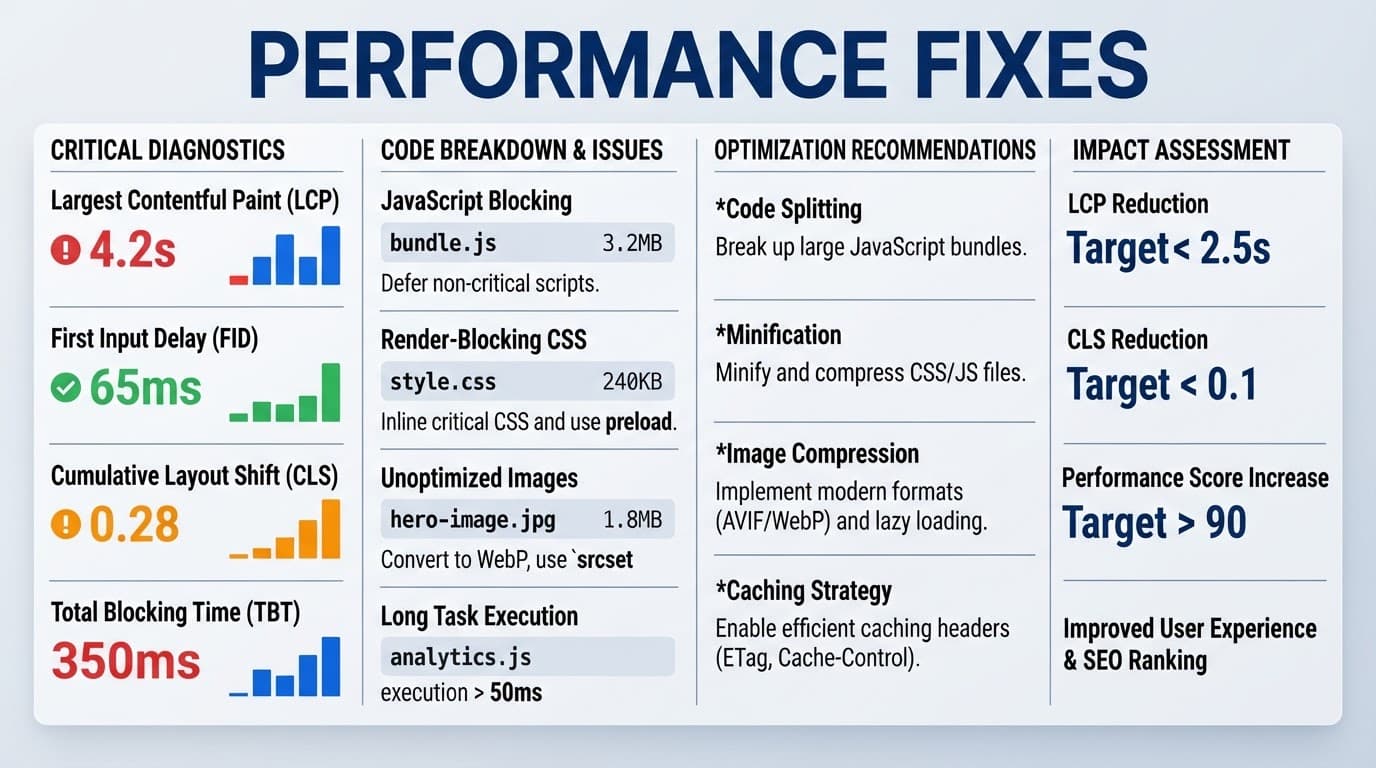
Report details turn a number into a repair plan. Use lab data to isolate the likely cause before changing code.
For Largest Contentful Paint (LCP), identify the largest element, server response time, and delayed resources. Lab data can help you inspect resource timing. For Interaction to Next Paint (INP), review long JavaScript tasks and other work that blocks the main thread. For Cumulative Layout Shift (CLS), find the elements that moved and determine why no space was reserved.
Recommendations are clues, not automatic commands. Use lab data to compare potential fixes before applying them. Removing a script may improve one result, but it could also disable a form or payment function or prevent an essential analytics event from firing.
Practical fixes for faster, steadier pages
Compress images, use modern formats where appropriate, and send responsive image sizes instead of one oversized file to every screen. Faster hosting and sensible caching can reduce server delays. Use lab data to confirm which resources cause the biggest delays.
For code optimization, reduce unused JavaScript, split long browser tasks, and delay nonessential third-party scripts. Keep work off the main thread when possible. Reserve fixed space for images, videos, ads, and embeds. Load fonts carefully so text doesn’t jump after it appears.
Test the affected mobile page and its shared template after each change. Use lab data to verify the repair and compare before-and-after results. Publishers with ad-heavy pages should also review guidance on fixing slow ads and embeds.
Why a Good Tester Result Does Not Guarantee a Good Website
Results may vary as content, plugins, ads, traffic, server load, and test locations change. Core Web Vitals are part of page experience, but they don’t replace helpful content, accessible design, secure pages, clear navigation, or a convincing conversion path.
Retest key templates after updates. Monitor the homepage, blog posts, service pages, product pages, checkout paths, and lead forms because each can fail for different reasons. Performance optimization should support the entire website experience.
Use the right tools for the question
PageSpeed Insights provides a quick page report with available field data and controlled lab data. Search Console identifies sitewide patterns that help put page-level lab data in context.
Lighthouse provides controlled audits with lab data. It includes supporting diagnostics such as First Contentful Paint, Total Blocking Time, Time to Interactive, and Speed Index. Chrome DevTools helps developers inspect network activity, lab data, and browser work on the main thread.
The Chrome User Experience Report shows broader real-user trends that lab data cannot capture. Google’s Web Vitals resources explain how these tools and metrics fit together. No single report tells the entire story.
Avoid common mistakes when interpreting results
Don’t test only the homepage or rely on a single desktop run. One lab data snapshot can hide real-world variation. Don’t treat a Lighthouse score as a guarantee of better search rankings, either.
Prioritize failed user experience metrics over low-impact warnings. Also, don’t assume every URL needs the same repair. A slow hero image affects LCP, while a late ad slot may be the real visual stability problem. Core Web Vitals show important signals, but they don’t explain every issue.
Frequently Asked Questions
Does a 100 performance score mean a page passes Core Web Vitals?
No. A score in PageSpeed Insights comes from Lighthouse and controlled lab data. Real-user results come from the Chrome User Experience Report, so review LCP, INP, and CLS directly.
How long do Core Web Vitals changes take to appear?
Lab data can change as soon as you retest. Real-user data usually needs time because it reflects a rolling 28-day collection period.
Can a WordPress plugin fix every Core Web Vitals issue?
No. A plugin may help with caching, image delivery, or code optimization. It can’t fix slow hosting, a heavy page design, or excessive JavaScript work on the main thread without careful configuration.
Do Core Web Vitals affect search rankings?
Google includes page experience signals in its broader ranking systems. They aren’t a standalone ranking factor, so useful content and relevance still matter. Performance work should improve user experience rather than chase a score.
A Faster Page Should Feel Better, Not Just Score Better
Core Web Vitals measure page performance: LCP measures loading, INP measures response speed, and CLS measures visual stability. Check real-user data first, then use lab reports to trace the biggest shared problems.
The goal isn’t a perfect report. The goal is a user experience that feels fast, responsive, and steady when real visitors arrive.